
There are any number of tools for resizing the browser window to check responsive designs. One that stands out for me is the Media Query Bookmarklet from the Sparkbox Foundry. This shows you the currently applied media queries and browser size in both pixels and ems.
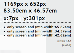
Once you've used this you'll wonder how you managed without it.
Note: The main page says in works in Chrome and Safari. It also works in IE10.
Details at http://seesparkbox.com/foundry/media_query_bookmarklet