At MIX 2009, the Expression Blend team cam up with a new concept called Behaviors. In fact, the only thing new is the way that the Behaviors are packed. WPF developers have been doing what we called “Attached Behaviors” for quite some time already: see this thread (dated July 2008) to read a discussion around this topic at the WPF Disciples group.
Attached Behaviors leverage a feature of WPF called Attached Properties, that allows you to add a property to an element even if this element doesn’t implement it. When the Attached Property value is set (or changes), you get an access to the element to which the property is attached, and you get a chance to attach an event handler to it, or to modify how it looks, reacts, etc… This is why we call this Attached Behavior. In fact it is similar to extension methods in C#: You define a method somewhere in your code, and you attach it to another element that doesn’t know about it. For more information about attached behaviors, you can read the article that my good friend and fellow WPF Disciple Josh Smith wrote about them.
The Behaviors proposed by the Blend team are using Attached Behaviors under the covers, and propose a neat way to “pack” them and to attach them to an element. In this post, we will see how I built a Behavior that you can use to add a magnifying glass to a WPF application in just a few lines of XAML (the Behavior implementation needs more than that though 😉 but it is neatly packed and can be reused).
In this article, you will see
- How to download the assemblies needed.
- How to add them into Expression Blend 3 or in Visual Studio 2008.
- How to set the ZoomBehavior’s properties.
- How the ZoomBehavior is built (and of course you can download the source code).
- And a sample application.
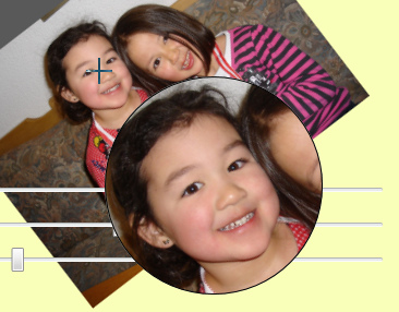
Default magnifier on a picture
Why Expression.Interactivity?
This question was asked many times after the Behaviors were shown at MIX: Why do I need to add a reference to an Expression Blend assembly to use Behaviors in my application, even though they do not really have anything to do with Blend? Sure, Blend provides a nice way to add a Behavior to an element visually, but you can do the same in XAML.
The answer is that Behaviors have been implemented by members of the Blend team, and are still very new. They just needed a place to store them, and it made sense to them to put that code in an assembly that comes with Blend. In my opinion it was not the best choice, and putting Behaviors in the WPF Toolkit (and in the Silverlight Toolkit) would have been a better option. I suppose that this will change later, and that Behaviors will maybe even flow into the .NET framework (and maybe even into the System.* namespace).
What does the behavior do?
The ZoomBehavior I developed and expose here allows to easily add a magnifying glass to any WPF window. With just a few lines of XAML code, you add a relative complex functionality. You can have any shape and any content – photos, videos, user interface elements, shapes, etc…
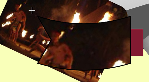
Custom magnifier on a video
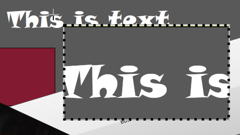
Custom magnifier on text
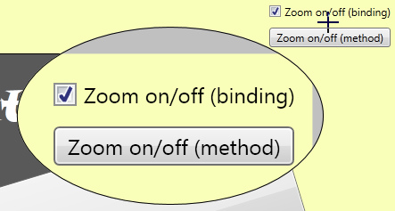
Default magnifier with custom width on UI elements
What about Silverlight?
Behaviors work in Silverlight as well as in WPF. The mechanisms they rely on are compatible. However, my ZoomBehavior does not work in Silverlight, because it relies on a class named VisualBrush that is not available in Silverlight yet. Also, I draw the magnifying glass on the Adorner layer, which is not available in Silverlight applications (but we could imagine a workaround for that particular limitation).
In other words, if you do Silverlight code, you can learn from this sample, but you cannot use it.
Using the ZoomBehavior in Expression Blend 3
Expression Blend 3 is probably the easiest way to add a Behavior to an application. You will need Expression Blend 3, which is currently in Community Technology Preview state, and can be downloaded here.
- Download my Utilities assembly. This assembly is in a Zip file. Extract it to a local folder.
- In Blend 3, right click on the Project tab, on the References folder.
- From the context menu, select Add Reference. Navigate to the folder containing the Utilities assembly, select it and press OK.
- Build the application. This ensures that all the referenced assemblies are copied to the bin/Debug folder.
- Open the Assets Library.
- You should see the ZoomBehavior in the Behaviors tab.
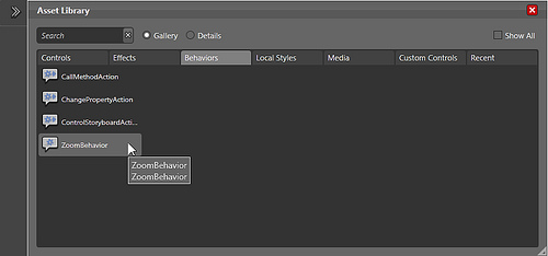
The Asset Library and the ZoomBehavior
- Drag and drop the ZoomBehavior on any element in the Window.
Note: Typically, you want to add this behavior to the LayoutRoot panel (the first element under the main window). Even if you add the ZoomBehavior to a child element somewhere in the window, the magnifier will be added to the window’s Content element, and will be visible in the whole window. - You should see the behavior appear in the Objects and Timeline panel.
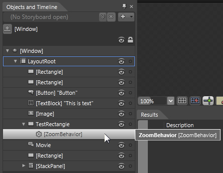
Objects and Timeline panel
To toggle the magnifier on and off, you need a little snippet of code. For example, you can use a ToggleButton and then write the following C# code:
- First add the following using directive to the top of the page:
using GalaSoft.Utilities.Wpf.Zoom;
- Then, use this snippet for the Click event handler on the Button:
///

/// Test the ToggleZoom extension method
///

private void Button_Click(object sender, RoutedEventArgs e)
{
  TestRectangle.ToggleZoom();
}
The result is a round magnifier, with a magnifying factor of 2.0 and a diameter of 200 pixels. You will see below how to change the size and aspect of the magniifier.
Alternatively, you can use the IsVisible dependency property on the ZoomBehavior object, set it directly or data bind it, for example to a checkbox or a ToggleButton, or any other boolean property.
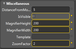
ZoomBehavior properties in Blend 3
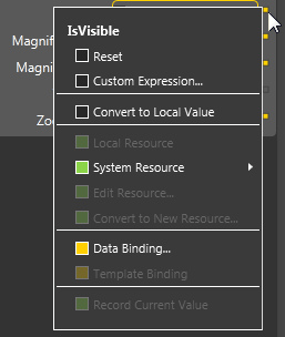
Binding the IsVisible property in Blend 3
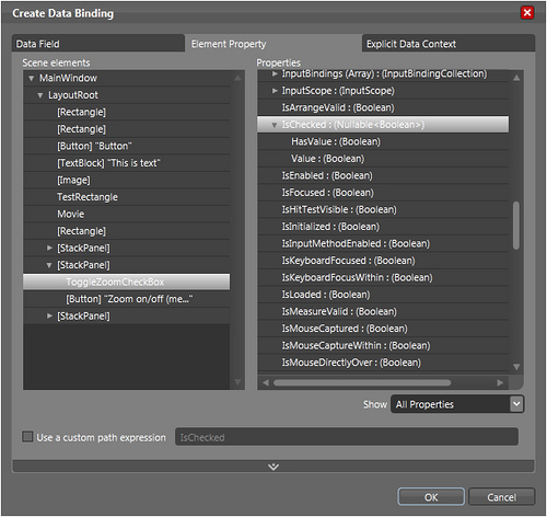
Binding the IsVisible property in Blend 3
Using the ZoomBehavior in Visual Studio
Adding the magnifier can also be done directly in XAML, without using Blend 3:
- Download my Utilities assembly and the Microsoft Expression Interactivity assembly. These assemblies are in a Zip file. Extract them to a local folder.
- In Visual Studio, add a reference to both assemblies to your WPF application
- Right click on the References folder
- Select Add Reference from the context menu
- Browse to the folder in which you saved both assemblies above, and select them. Then press OK.
- In XAML, add two XML namespaces to the Window tag:
xmlns:i="http://schemas.microsoft.com/expression/2009/interactivity"
xmlns:zoom="clr-namespace:GalaSoft.Utilities.Wpf.Zoom;assembly=GalaSoft.Utilities"- Add the following attached property to the element you want to attach the magnifier to (in that case, the Rectangle named TestRectangle).
Note: Typically, you want to add this behavior to the LayoutRoot panel (the first element under the main window). Even if you add the ZoomBehavior to a child element somewhere in the window (like in this sample), the magnifier will be added to the window’s Content element, and will be visible in the whole window.
<Rectangle x:Name="TestRectangle"
           Fill="#FF821A32"
           Stroke="#FF000000"
           HorizontalAlignment="Right"
           Margin="0,260,17,354"
           Width="179">

  <i:Interaction.Behaviors>
    <zoom:ZoomBehavior x:Name="MyZoom" />
  </i:Interaction.Behaviors>

</Rectangle>
Here too, to toggle the magnifier on/off, you need to add the namespace GalaSoft.Utilities.Wpf.Zoom to your code-behind, and then call the extension method ToggleZoom() on the element to which you added the behavior. For example:
TestRectangle.ToggleZoom();
And of course here too you can use a binding on the IsVisible property
<i:Interaction.Behaviors>
  <zoom:ZoomBehavior x:Name="MyZoom"
                     IsVisible="{Binding ElementName=ToggleZoomCheckBox,
                                         Path=IsChecked, Mode=TwoWay}" />
</i:Interaction.Behaviors>
Using properties
There are a number of properties that you can use to customize the magnifier’s look and feel. All these properties are Dependency Properties, which means that they can be data bound or animated, such as in the sample that you can download below.
Zoom factor
The property ZoomFactor can be set to any value between 1.0 and Double.MaxValue. The default value is 2.0.
Magnifier height and width
The properties MagnifierWidth and MagnifierHeight govern the dimensions of the magnifying glass. Default value: 200 px * 200 px.
Distance from the mouse
When the magnifier is visible, the mouse cursor turns into a cross. The magnifier appears next to the cursor, either left or right, below or above, depending on the mouse position. If you move the mouse too fast, the cursor might “land” on the magnifier, which you want to avoid. In that case, and depending on the shape of the magnifier, you may want to increase the distance from the mouse, using the DistanceFromMouse property. Default value: 5 pixels.
Magnifier shape
By default, the magnifier is an Ellipse. You can however specify any shape you want, using the Template property.
- Create a ControlTemplate, either in Blend or in Visual Studio.
- The ControlTemplate must target a Control (TargetType property).
- One of the elements of the ControlTemplate must set its Fill (or Background) property to a TemplateBinding on the Control’s Background. This is where the magnified view will appear.
- Save this template in the window’s resources (for example).
- Set the ZoomBehavior’s Template property to the saved ControlTemplate.
For instance:
<ControlTemplate x:Key="ZoomGlassTemplate1"
                 TargetType="{x:Type Control}">
  <Grid Background="Silver">
    <Rectangle Fill="{TemplateBinding Background}"
               Stroke="#FF000000"
               StrokeThickness="5"
               StrokeDashArray="1 2" />
  </Grid>
</ControlTemplate>
and
<i:Interaction.Behaviors>
  <zoom:ZoomBehavior x:Name="MyZoom"
                     Template="{StaticResource ZoomGlassTemplate1}"
                     DistanceFromMouse="20" />
</i:Interaction.Behaviors>
Tip: You want to make sure that an opaque background is set in your template (in that case, the Grid’s Background is set to Silver), to avoid having a transparent background and seeing the window’s content below the magnifier when it is close to the window’s edges.
IsVisible
This boolean property can be set directly, or data bound for example to a checkbox, to toggle the magnifier on and off.
Downloads
You can download the following files:
- Assemblies needed to add the ZoomBehavior to your application (GalaSoft.Utilities and Microsoft.Expression.Interactivity).
- Source code for my Utilities classes (the ZoomBehavior classes are into the Wpf/Zoom subfolder)
I hope you’ll have fun playing with this behavior, and feel free to give me your feedback!
Sample application
The sample application allows you to test the ZoomBehavior with multiple shapes, sliders for dependency properties and dynamic content.
- Use the shapes on the left to change the shape of the magnifier. The round shape sets the default template. The other two templates are defined in Window1.xaml.

RadioButtons to choose templates
- Use the button and checkbox on the top right to toggle the magnifier on/off. You can use the ToggleZoom extension method, or use the IsVisble dependency property on the ZoomBehavior.
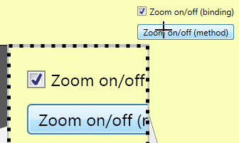
Toggling the magnifier on/off
- Press the “Z” key to toggle the ZoomBehavior on/off.
- Pass the cursor on UI elements, shapes, image and even video and see the magnified content
- Use the sliders on the bottom right to change the width, height and the zoom factor of the magnifier.

Changing the width, height and zoom factor
How does it even work?
The ZomBehavior relies on three classes.
- ZoomBehavior
- This class inherits the Microsoft.Expression.Interactivity.Behavior class, which is a generic class. The ZoomBehavior can be attached to any FrameworkElement. However, the magnifier will always be available for the whole window containing the FrameworkElement.
- This class also defines a set of dependency properties detailed above in the Using Properties section.
- The ZoomBehavior also defines a method used to toggle the magnifier on/off. There is also another way to toggle the magnifier, using an attached method.
- To get a grip on the FrameworkElement using the behavior, you can override the OnAttached method, which will be called when the behavior is attached to an element. Then use the AssociatedObject of the Behavior class, which is automatically casted to a FrameworkElement in ZoomBehavior (thanks to the generic implementation).
- ZoomAdorner
- This class inherits the System.Windows.Documents.Adorner class, that defines objects that can be added to the AdornerLayer.
- The AdornerLayer is a special layer that is guaranteed to always appear in front of all the other elements on the window. This is perfect to draw decorations for objects (such as handles to resize an element) or in our case, to make sure that the magnifier is on top of all other elements.
- If no template is defined, the method CreateGlass will create an Ellipse to display the magnified view.
- If a template is defined, the method CreateGlass will create a Control and apply the template to that element. This allows using any shape to display the magnified view.
- We override a few methods and properties in the ZoomAdorner class, to allow placing any element in the AdornerLayer. We use the helper class VisualCollection to create a tree of visual elements below the adorner. This requires overriding VisualChildrenCount, GetVisualChild, ArrangeOverride and MeasureOverride.
- We attach an event handler to the root element on which the magnifier is displayed, to track mouse movements. When we detach the adorner, we must remember to remove the event handler to avoid memory leaks.
- The magnified view is provided by a VisualBrush. This is a representation of the observed scene, which we can move by changing the ViewBox property.
- The method SetGlass is called everytime that the mouse moves, or that the aspect of the magnifier changes (through a dependency property). It is used to calculate the magnifier’s size, position, and the ViewBox of the VisualBrush.
- ZoomExtension
- This class is a utility class, that defines an extension method available on every FrameworkElement.
- The method ToggleZoom will only be active on the element on which you added the ZoomBehavior. On other elements, it will simply be ignored.
License
The GalaSoft.Utilities assembly and all the classes it contains are distributed under the Creative Commons License (Attribution 3.0 Unported).
http://creativecommons.org/licenses/by/3.0/
Conclusion
I hope you will have fun using this behavior. For me it was a great occasion to learn how to program behaviors, and to review the Adorner Layer, a great feature of WPF applications. But having played with the ZoomBehavior quite a lot in the last few days, I think it has a potential for many WPF applications. Feel free to use it!


